Be yourself; Everyone else is already taken.
— Oscar Wilde.
This is the first post on my new blog. I’m just getting this new blog going, so stay tuned for more. Subscribe below to get notified when I post new updates.
Be yourself; Everyone else is already taken.
— Oscar Wilde.
This is the first post on my new blog. I’m just getting this new blog going, so stay tuned for more. Subscribe below to get notified when I post new updates.
This has been an interesting project, makes me wonder how people in the industry are able to execute such ideas that can create an impactful message to an audience. Through this project I learned that translate assess client needs and translate them into a media using layout techniques, creative typography, and image creation/manipulation. Hope to be able to use visual metaphor in order to communicate what I’m trying to say. I hope I executed the process in an fun interesting way. Though the ideas never stopped flowing just trying to find the one that stuck was the hardest part of this particular project, who knows? maybe I’m just an overthinker, you know, like many others out there.

After getting to see the kind of person the client is I was able to determine some of the things she would like to see on this redesign of her ad. Something that can be expressive, but clean, but that can also be fun to look at and make you want to go to their place of business.
Through the thumbnail process I was able to produce a number of ideas, good and bad, that I could take from each in order to produce a more solid and clean piece. Moving forward I find that it will be beneficial for me to create thumbnails in order to create a stronger design. It lets you throw all these ideas out there that can make or break you, but you will never know how things could work unless you let the idea flow from pen to paper.
I feel like everyone loves to explore and mess around with colors but being limited to black and white sort of made the thought process a bit bland. Though once I started to figure out where to use the colors there was a challenge in trying not to make it look too boring. With size limitations, there was not a lot of places to go crazy with design, since we had to make sure the information is legible. So the body copy of what the studio had to offer was a bit of a pain because it felt like an afterthought every time I was attempting to wrap this project up.
I decided to use black, whites, and gray tones in order to give the layout a more playful tone. By doing so, I felt that I was able to get the reader to dart towards the important information, as well as see the whole layout as a whole by sandwiching gray text between white fonts.

When determining the typeface I wanted something bold that could catch the reader’s attention in the sea of other posted ads. Just because the format size is small does not mean that the typeface has to feel the same.
Like any design I feel like there’s more that can be done. After a couple of editing and thinking I was happy with the overall layout I found myself wanting to go back and move a few more things around. Overall, I believe I was able to communicate an effective and clean message to my intended audience.
I hope I did. I’ve had to deal with client’s before and even when you think you’re in their heads it sometimes doesn’t work out like that. By taking notes and getting them to explain what they mean is always the best way to ensure you get it as close as you possibly can.
Having learned the process I would definitely put this piece in my portfolio, and even some different iterations to show the many ways this project can be seen.
While working on this project I am seeing that you’ll be working on even the smallest of formats, that there are limits on the things you can do, and though it is not something you’re used to it will be something you might have to do in the future. One shouldn’t discard the idea of working on something they have never worked on before, because coming up with new ways will be how you’ll get stronger as a designer.
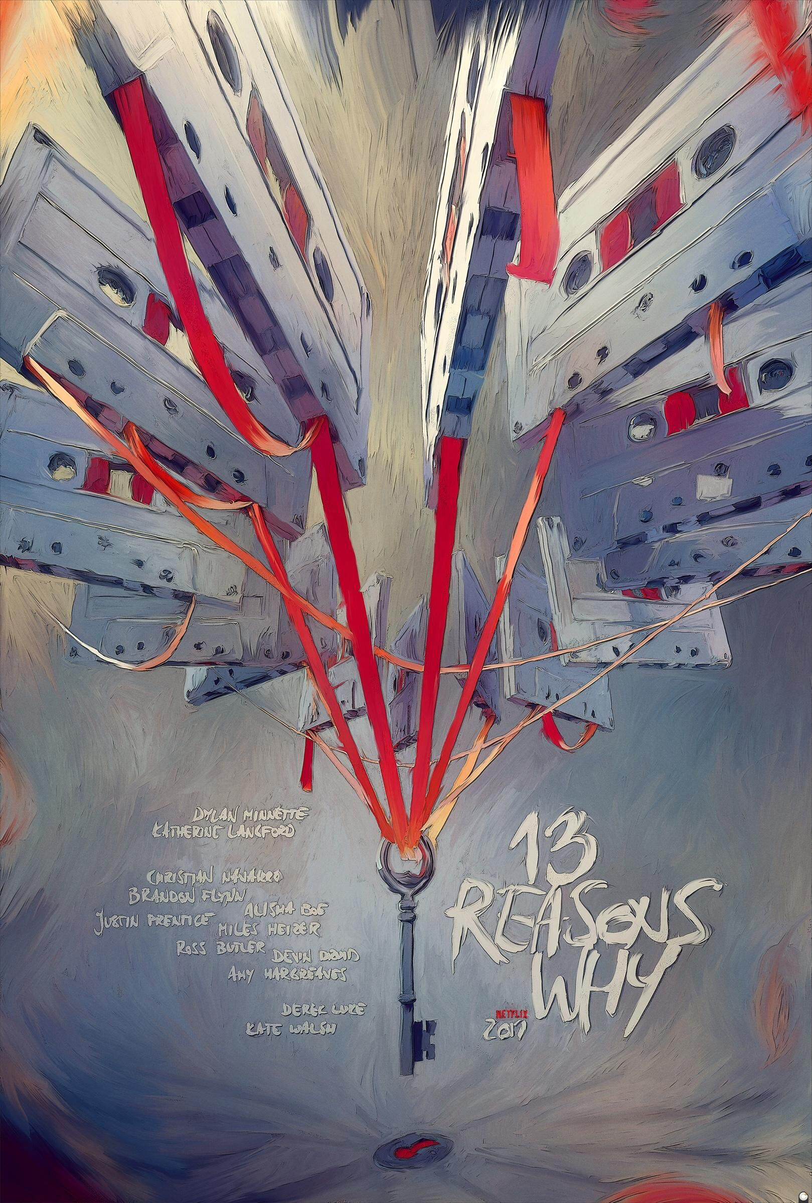
This poster works at catching my attention by drawing me in with its use of hot and cold colors and direction towards the key that dangles at the center. It seems sort of chaotic, but mysterious at the same time.
The type follows the painterly style that is presented through the poster, the title
“13 Reasons Why” is just as bold and screams out, and with the cassette tapes above the type it feels as though there is a sense of movement/vibration.
The message and tone of the poster is poetic, here you see a key that’s being dangled over a keyhole and all the film from the cassettes holding on to this key that can potentially unlock the reasons why they were created, why they are there.
The design and layout is powerful, the painted style is captivating, and there’s just a feel of movement as the key is being hoisted down.
The target audience, I believe, is those that enjoy a good mystery which there can’t be a specific age group when it comes to that but I suppose the ones that would pick it up would be teenagers to adults, 18-30 age group perhaps. I can see this ad in People magazine, bookstores, and social media (ie. Facebook, Twitter).
Overall, I believe this ad is successful if you’re into getting pulled in into a mystery or thriller of sorts. If I was passing by this poster I would be intrigued by the what this ad could be about and look it up online.

