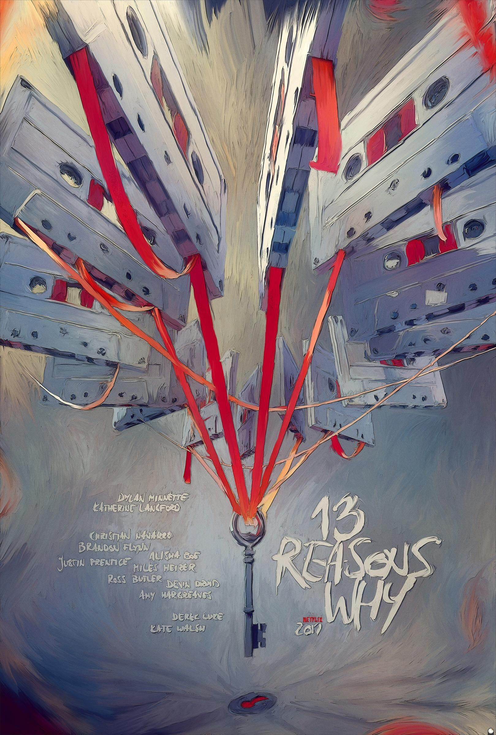
This poster works at catching my attention by drawing me in with its use of hot and cold colors and direction towards the key that dangles at the center. It seems sort of chaotic, but mysterious at the same time.
The type follows the painterly style that is presented through the poster, the title
“13 Reasons Why” is just as bold and screams out, and with the cassette tapes above the type it feels as though there is a sense of movement/vibration.
The message and tone of the poster is poetic, here you see a key that’s being dangled over a keyhole and all the film from the cassettes holding on to this key that can potentially unlock the reasons why they were created, why they are there.
The design and layout is powerful, the painted style is captivating, and there’s just a feel of movement as the key is being hoisted down.
The target audience, I believe, is those that enjoy a good mystery which there can’t be a specific age group when it comes to that but I suppose the ones that would pick it up would be teenagers to adults, 18-30 age group perhaps. I can see this ad in People magazine, bookstores, and social media (ie. Facebook, Twitter).
Overall, I believe this ad is successful if you’re into getting pulled in into a mystery or thriller of sorts. If I was passing by this poster I would be intrigued by the what this ad could be about and look it up online.

